Sleep Data as Audio Waveforms
Representations of Personal Data Assignment for CS 8803 CDP (Spring ‘24) @ GeorgiaTech
Process
Step 1: Collect Data.
The first step of my process was of course to collect data. I knew from the get-go that I wanted to track my sleep, as I had been struggling to get good rest for the past few months. I decided I would track my sleep using a Samsung Galaxy Watch4. This was a strategic decision, as I did not know yet what kind of sleep data I wanted to collect, and the watch has a variety of sensors that could be used to track different aspects of my sleep. As such, I decided to collect as many different categories of data while sleeping and decided at a later date which one I would eventually use.
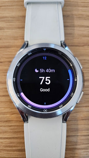
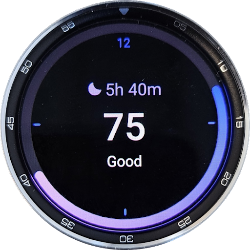
Figure 1. Samsung Galaxy Watch4
The Samsung Galaxy Watch4 collects a variety of different data while sleeping. For example, it keeps track of the length of sleep, which sleep stage you are in at any given time, your blood oxygen levels, and even detects and tracks snoring. The Samsung Health App takes all of this data and arranges them in visual graphs for the user. These visualizations served as heavy inspiration for my project.
I collected data for about two weeks, and then decided to combine sleep stage and blood oxygen data for my project.
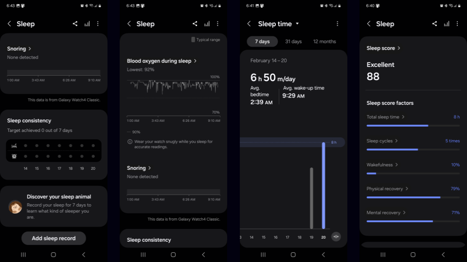
Figure 2. Screenshots of Samsung Health App
Step 2: The Plan.
The plan (at least in the beginning) was to create a circular visualization around a clock. The Samsung Health app creates an interesting visualization with sleep stages: it is a sleep stage vs time graph, and because people move between the four different sleep stages multiple times a night, it creates a jagged graph.
I wanted to make a visualization where the sleep stage and blood oxygen graphs are somehow wrapped around a clock so I could see how my sleep stages and blood oxygen levels change over time. I also wanted to add a feature where I could see my average sleep stage and blood oxygen graph across the data recording period.
I quickly realized however that this was simply not an interesting visualization. It would just be a lazy rehash of Samsung's own visualization, just in a circular form. I decided I wanted to do something more interesting.
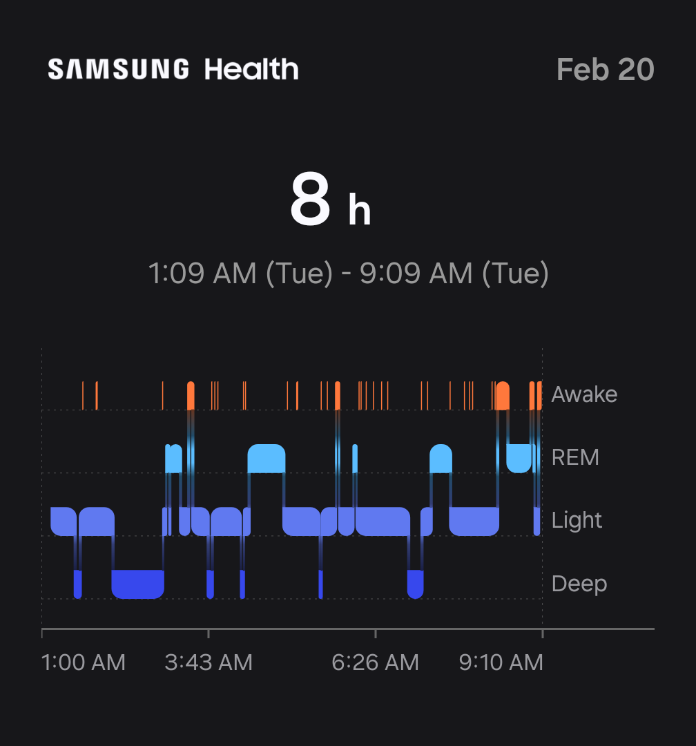
Figure 3. Initial Inspiration
While doing research for my own personal projects, I came across an image of a MIDI programming software, and thought Samsung's Sleep Stages Visualization resembled MIDI programming. This led me to the idea of creating a MIDI file from my sleep stages data, and then using that MIDI file to create a waveform visualization of my sleep stages that has been EQ'ed with blood oxygen data. I could theoretically wrap the audio waveform around a circular clock to achieve something similar to my original idea, but slightly different.
Eventually I decided to ditch the whole clock idea and just focus on the waveform visualization. I wanted to resulting audio to be somewhat listenable; at least, not horrible. So I decided I would use a familiar chord progression: I - VI - II - V in Cmaj7. I would map each sleep stage to a chord, and then program it into a MIDI file, which I could later EQ with blood oxygen data and add effects to.
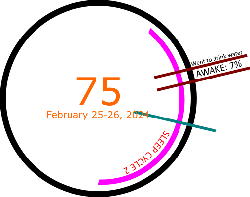
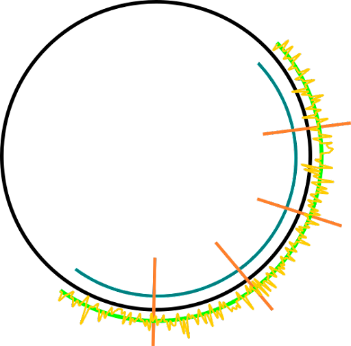
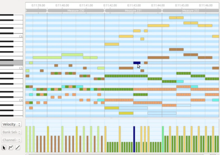
Figure 4. Design Sketches + MIDI Programmer Inspiration
Step 3: Data Processing.
The first step was to convert the sleep stages data into MIDI. In order to do this, I downloaded my sleep data off of the Samsung Health App. The sleep stages were recorded to a CSV file, along a bunch of other garbage data that I did not need. In order to properly process the data and remove any unnecessary parts, I wrote a Python script that took out the relevant data: start, stop, and stage. I organized each set of data by date.
The script would also map each stage to a corresponding chord. I used the Cmaj7 chord progression (Awake: Cmaj7 -> REM: Amin7/Emin7 -> Light: Dmin7/Fmaj7 -> Deep: Gdom7), and the script would randomly add variance to keep it less monotone.
Data Processing, contd.: Convert Chords to MIDI.
Once the Sleep Stage to Chord Progression Mapping is created, I used the MIDIUtil library to create a separate MIDI file for each sleep session, which are segmented by date. I then used the Mingus library to convert the chords to notes and wrote them to their correct MIDI files.
Each Sleep Stage has data on how long it lasted. I used this data to approximate the number of minutes during each sleep stage. The number of minutes in a stage corresponds to the number of 4/4 bars in the MIDI file. For example, if a sleep stage lasted 12 minutes, it would be equivalent to 12 bars in the MIDI file. In order to shorten the audio length, I set the BPM to 960.
Data Processing, contd.: Encoding Timings for Waveforms.
The final step to processing the data was to encode the timings for the waveforms. This was to ensure the visualization could display the sleep stage accurately at any given time during the audio playback.
Once again, I used Python to write a script that takes the thus-far processed sleep data, converts the Sleep Stage duration into bars, then converts bars into seconds. This data basically maps the chords corresponding to the sleep stages to the time when they first start playing in the audio file.
Step 4: Equalizer & FX.
The next step was adding EQ and FX to the MIDI data. MIDI, which stands for Musical Instrument Digital Interface, is a digital protocol that allows electronic instruments, computers, and other devices to communicate with each other. It is not an audio file, but rather a set of instructions that tells a device what notes to play, when to play them, and how loud to play them. As such, I needed to add an instrument to the MIDI file, and then EQ and add effects like reverb.
In order to do this, I used REAPER, a digital audio workstation and MIDI sequencer software. I mapped grand piano audio as well as REAPER's ReaSynth plugin synthesizer to the MIDI data. I then added a ReaEQ to each track as well as the master in order to mellow out the synthesizer audio, making it less cacaphonic. I added just a touch of reverb to make the piano less jarring. I then used the blood oxygen data as a model for adding triangle and saw-tooth modulation. Because I could not get the blood oxygen data from Samsung, I had to use the graphs provided in the app and copy the EQ waves by hand.
Finally I rendered all of the MIDI files, now with audio mapped, equalized, and with effects, into individual WAV files. I also created a single WAV file that combined all of the individual tracks into one audio file.
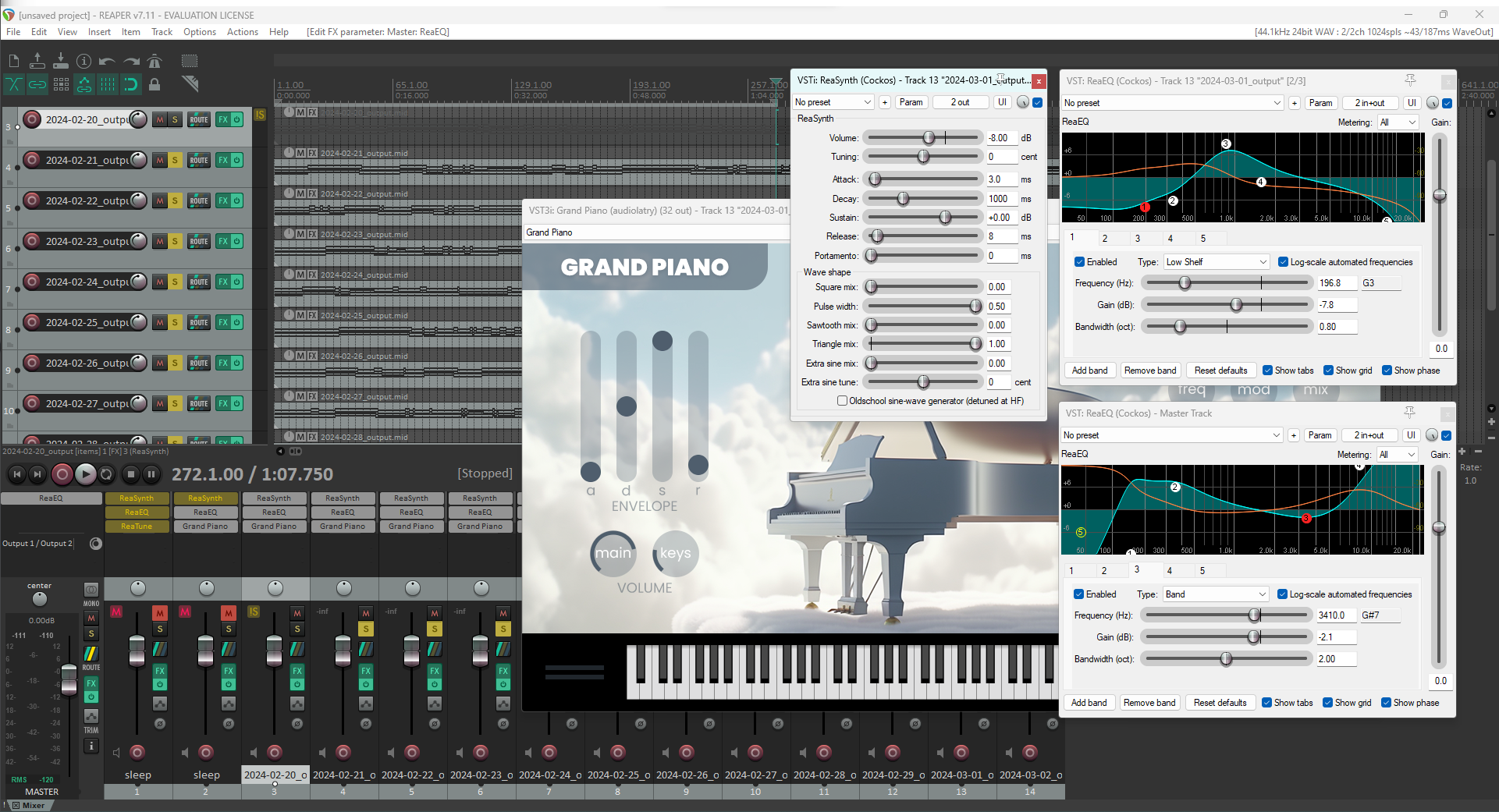
Figure 5. REAPER DAW, EQ, and FX
Step 5: Visualization.
The final step was to create the visualization. I used AudioMotion, an audio visualization library, to create the visualization on the fly as the audio plays. I went through several different iterations. Originally I wanted to create a circular visualization, but since I decided to avoid the clock idea, I initially abandoned this effort and opted for a simple, linear frequency visualization.
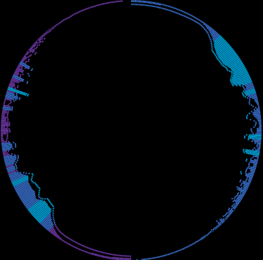
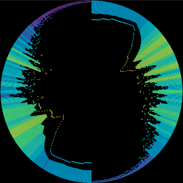
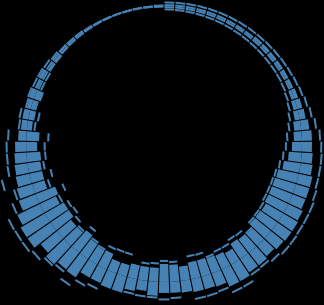
Figure 6. Circular Visualization Prototypes
The idea behind the waveform visualization is directly tied to the audio, and therefore time. In essence, the linear visualization shows three axes of data: frequency range on the x-axis, gain (volume) on the y-axis, and time as the audio plays. This single visualization is enough to view every detail about the audio files I created using the sleep data. As shown in Figure 7, the audio visualization shows the sleep stages as they change over time (red), and the blood oxygen data can be seen by the saw-tooth pattern to the right of it.
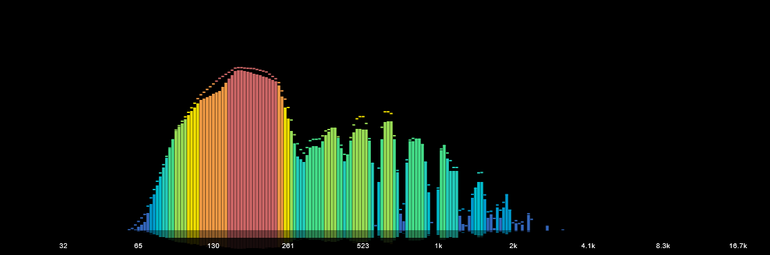
Figure 7. Linear Visualization Prototype
Step 6: Final Product.
However, the single waveform felt a little lackluster, so I decided to revisit the circular visualization idea. I created a circular and mirrored version of the linear visualization instead, and added live captions using the sleep stage timing data to describe exactly what sleep stage I was in, along with the audio chord that was played.
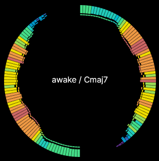
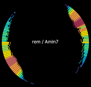
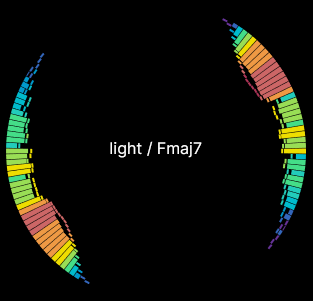
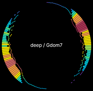
Figure 8. Circular Visualizations w/ Live Captions
I deemed that just the linear visualization or just the circular visualization did not do much to show the data, so I decided to display both of them, as well as two other similar visualizations. Besides the circular and linear banded visualizations, I added a line visualization that highlights the blood oxygen data, and a frequency resonance graph visualization that highlights the sleep stages.
Finally, I added an overall graph that shows all of the sleep stages in order to give viewers an overall picture of that sleep session.
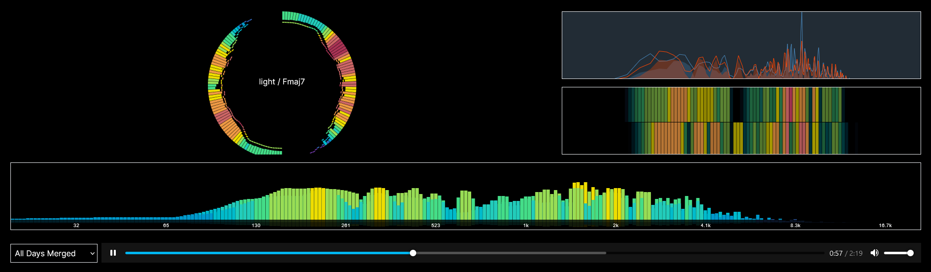
Figure 9. Final Product
Subversion of Visualization Best Practices
The final product, in retrospect, is not a good visualization in terms of what is generally accepted as visualizations. The word visualization, and particularly data visualization, implies that the data is being soley consumed by the eyes. This project aims to subvert these expectations by introducing audio to the visualization.
Cont.
Within the Data Feminism framework, this subversion of expectations and best practices is a form of challenging power. The field of data visualization often prioritizes the visual over the auditory, leaving the visually impaired with very little to work with. This project aims to challenge that status quo by serving the data through audio.